In a fast-evolving digital landscape, staying ahead means rethinking how we approach content, websites, and—perhaps most importantly—how we measure marketing success in our digital-first world.
Today’s marketing leaders are navigating a landscape that’s light-years beyond the days of simply building a website and counting clicks or impressions. They’re managing a full ecosystem of channels, content platforms, data streams, and customer touchpoints. Success is now about connecting this maze of data points—tracking customer engagement, journey paths, conversion rates, lifetime value, and more.
But when data sources don’t communicate and data silos form, it becomes nearly impossible to see how each piece of the strategy contributes to the whole. Marketers are left with only a partial view of what’s actually working—it’s like trying to complete a jigsaw puzzle with half the pieces missing.
App proliferation: The opportunity cost of disconnected silos
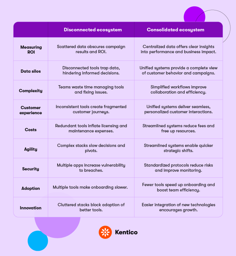
For too many businesses, data is scattered across a multitude of systems. ROI is murky, KPIs don’t tell the full story, and reporting is painfully unclear.
When managing an ecosystem that splinters in every direction, the investment alone becomes difficult to justify—think servers, overheads, contracts—and security quickly turns into a major headache. How do you scale a sprawling ecosystem? How do you contract it when needed, maintain control, and ensure data integrity so you can actually extract meaningful insights?
The more systems you add, the more cracks data can slip through, making it nearly impossible for teams to prove the true value of their efforts. It’s no wonder every CMO is asking: How can I really see what’s working, what isn’t, and why? How can I set up KPIs that genuinely reflect impact? Or do we just blow it all up and start fresh?
To map out the CMO’s next steps, we first need to understand how we got here. From my perspective, two main factors are driving app proliferation:
1. The marketers’ need for speed
If you ask any marketer why they spun up a WordPress microsite for their campaign rather than requesting IT to build it in the company CMS, they’ll tell you straight up: “I don’t want to talk to IT!”
It’s not just a language barrier between marketing and IT—these teams work at fundamentally different speeds. Marketing is always on, constantly reacting to trends, making rapid decisions, and moving fast to stay ahead. Time is of the essence, and they simply can’t wait for due process.
Need a campaign asset by Friday? Perfect! After a six-month procurement process, endless rounds of emails, signatures, and approvals, followed by developer implementation (assuming the budget hasn’t been withdrawn), you might get it launched by this time next year. But by then, the market has shifted, and the relevance is gone.
Marketers aren’t bypassing IT to be difficult; they’re doing it to meet customers where they are, when they’re ready to engage—not six months later.
2. Meeting arbitrary KPIs
While Key Performance Indicators (KPIs) are meant to guide and measure marketing efforts, in many cases, they actually contribute to the app proliferation problem.
Under intense pressure to meet their targets, marketers are picking up a wide range of platforms for specific needs—whether it’s creating content, tracking customer behavior, or automating outreach—without any central strategy to connect them. The result? A patchwork of platforms and data sources, each team running independently to hit their KPIs.
SEO suffers as content becomes scattered across disconnected sites. Customer experience becomes inconsistent, with each platform offering a slightly different look and feel. Security risks multiply as every new unapproved tool gets added to the mix.
With data siloed in countless systems, there’s no single source of truth. So even after working tirelessly to achieve their KPIs, marketers can’t prove they’ve actually hit their targets—let alone demonstrate that those KPIs were even useful in the first place.
The core case for consolidation
Without a centralized system, you're left with multiple silos, each with its own data set, platform, and reporting structure. This not only increases complexity and costs but also limits your ability to track the entire customer journey.
Now, think about what happens when you bring everything together. Consolidating your data sources into a single platform gives you a holistic view of your marketing efforts. Suddenly, you can see how customers are interacting with your brand across all touchpoints, how they move between channels, and where they are in their journey.
This visibility means you can identify what’s working and what’s not. You can analyze customer behavior across platforms, tweak campaigns in real-time, and understand how each element of your strategy is contributing to your goals. No more guessing, no more fragmented insights.
It’s like turning on all the lights and finding those missing puzzle pieces. Seeing the whole picture is what enables marketing teams to make informed, data-driven decisions that drive real results.
Reducing costs, streamlining efforts, and gaining clearer visibility are all big operational wins. But you know what’s really interesting? The impact a connected strategy can have on revenue.
Revenue is, after all, the bottom line for every marketing team. It’s what keeps the doors open and what ultimately measures the success of the strategy.
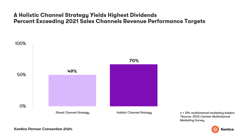
Take a look at this graph from the Gartner 2023 Multichannel Marketing Survey. In teams with a siloed approach, only 49% met or exceeded their sales channel revenue targets in 2021. But for teams using a holistic, integrated strategy, 70% reached or surpassed their targets.[1]

So, why aren’t more teams working this way? The same survey reveals[1] that in 2023, only 28% of organizations reported actually using a connected, end-to-end approach. And the reason is surprisingly simple: they don’t believe there’s a solution out there.
Of course, we know there is.
The centralized consolidated approach
At Kentico, we believe that a centralized approach to channel consolidation and management is the key. That’s why we’re adopting this approach architecturally.
A consolidated platform, like Xperience by Kentico, allows you to take control of your entire digital ecosystem. You gain real-time visibility into what’s working, what isn’t, and why. You can set KPIs that genuinely reflect impact, aligning your goals with measurable outcomes. There’s no need to blow everything up and start from scratch.
By consolidating content and managing your channels in one unified system, you gain the flexibility to expand, contract, pivot, test, and innovate—all without sacrificing what you’ve already invested in. You’re not throwing away data or losing traction on your campaigns. Instead, you’re building on your existing efforts, refining your approach, and clearly identifying what needs to be stopped, started, continued, or tweaked for maximum impact.
We understand you’re not likely to consolidate your entire tech stack overnight, but this is a significant step in the right direction—solving part of a very complex problem.
And let’s face it: today, we’re primarily talking about websites, but new channels will inevitably emerge, and they could eventually take center stage. Being agile and prepared to manage this evolution will be the key to sustaining long-term success.

The power of connection
The message couldn’t be clearer: the future of marketing success hinges on how well we bring all our pieces together. As exciting as today’s digital ecosystem is—with its countless data points, channels, and customer touchpoints—the reality is that these elements can’t thrive in isolation.
A connected, holistic strategy is more than just a nice-to-have; it’s what turns fragmented data into actionable insights and strategic wins. It’s about making sure that we have all the lights on and all the puzzle pieces in play.
In a world that’s evolving faster than ever, that’s the kind of clarity and control we need. This is what drives real, measurable growth.
Discover how to transform your marketing efficiency—download our free ebook, Simplify your life, to learn more.


