Connecting communities:
YMCA and Kentico
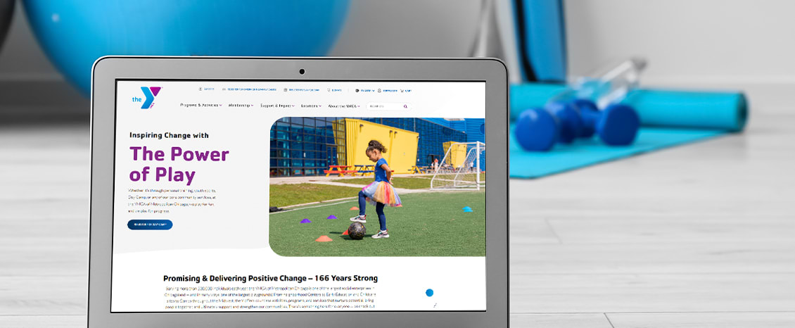
YMCA of Metropolitan Chicago partnered with the digital agency Americaneagle.com to create an improved digital experience for their members and content editors alike. Americaneagle.com opted for Kentico as an ideal solution due to its user-friendly interface and versatility, allowing the Y to enhance their connection with both members and non-members in their community.
Challenges
The Y’s website, a decade old, had become outdated and delivered a poor digital experience. To better serve members, program participants, and other Y communities—each with unique needs and goals—the association aimed to digitally transform its website to improve access to program and membership information. Additionally, the Y sought to merge its brochure and registration sites into a single, unified platform, providing users with a streamlined process for registrations and purchases.
Recognizing the need for a content management system (CMS) that staff could easily navigate, allowing them to quickly and independently create and edit content without developer assistance, the Y also wanted the CMS to offer customization options for the public-facing site while maintaining a consistent look and feel.
Solutions
Americaneagle.com structured the project into four phases:
Phase 1 involved discovery, including the development of a foundational strategy, user behavior analysis, search engine optimization (SEO) audit, Americans with Disabilities Act (ADA) audit, initial requirements gathering, and platform recommendation.
Phases 2 and 3 focused on the creation of new website designs and development planning.
Phase 4 transitioned the project into development, incorporating integrations with both internal and third-party systems, culminating in the website's launch.
To enhance the Y’s user experience, Americaneagle.com implemented several key features:
Navigation menus designed to provide intuitive access to the programs and content most important to site visitors.
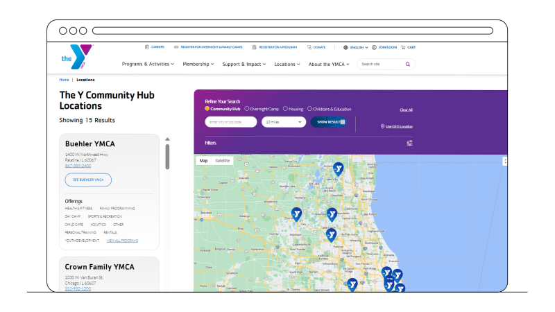
An easy-to-use location finder to help members locate nearby Y facilities.
Prominent calls to action guiding users to registration opportunities.
Comprehensive Spanish translation available throughout the website.
The team also integrated several third-party systems to enhance functionality and further streamline the user experience. These included:
CCC WebTIME API for member and program registration
Kissflow for private-rental bookings
Bluefin for secure payments and data security
Various Google APIs for spam protection and location services
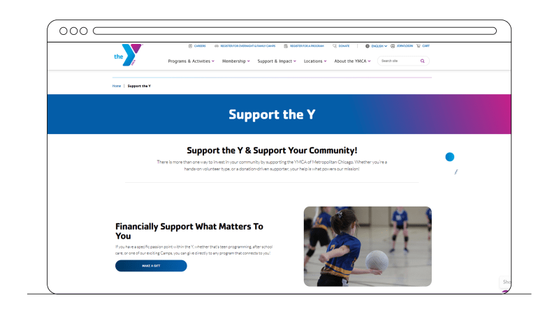
A large focus of this project was on the YMCA member journey in streamlining existing members' online experiences along with prioritizing access and opportunities for non-members as well. The new 'My Account' section offers users various tools for managing memberships, activity and program registrations, and making donations and outstanding payments).
It’s now easy to become a YMCA member. Site users select their local YMCA location, choose a membership type, add details about their account and family (if applicable), and then check out to make a payment.
Even non members can create accounts, enabling them to register for eligible programs like Child Care sports leagues and more. The account can also be used to make payments and maintain personal profile information and preferences.

“Our research has shown that members and communities across our association place a premium on being able to easily find, learn about, and register for their favorite activities, programs, and services. That’s why user ease, experience, and friendliness collectively served as our North Star in developing both the infrastructure and interface of the new site. Americaneagle.com met and exceeded our expectations on this and every other front in the new website development process.”
Results
Americaneagle.com has successfully launched a highly functional, user-friendly, and aesthetically pleasing website for the YMCA of Metropolitan Chicago’s community to engage with.
Internally, the Y editing team has appreciated the ease of use and intuitive features of the Kentico platform. They no longer require help with editing content, creating programs, posting news, or keeping homepage content relevant, nor to troubleshoot issues, open registrations, or address data discrepancies. Kentico’s Page Builder offers them a straightforward way to create and organize content using drag-and-drop features and customizable widgets. This level of autonomy has proven invaluable, allowing the team to allocate time and resources to other business areas.
From an external perspective, users now find it easier to navigate the site and access relevant information. By focusing on simplicity and user-friendliness, Americaneagle.com and the Y have redesigned the site to streamline user interactions, making it more intuitive for users to locate information and complete tasks. Kentico’s MVC CMS technology has also enhanced website and page load times.
Statistics
$387k in online purchases within 4 months of ecommerce setup
38% increase in users (YoY)
10% increase in new users (YoY)
18% increase in views (YoY) (2.2M views total).
16% increase in events (YoY) (5.7M events total)
