Website redesign that sparks member engagement
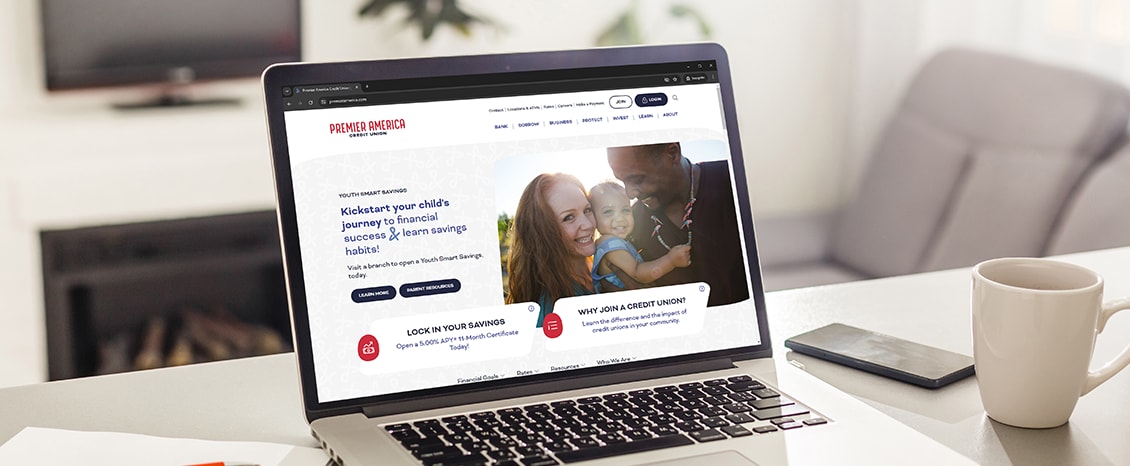
In 1957, Premier America Credit Union embarked on a journey to provide personalized financial solutions to its members and contribute to the well-being of the community. Recently, the credit union overhauled its brand identity and logo. Website transformation was a logical next step.
They've been using Kentico for years, so they turned to ZAG Interactive to upgrade the DXP and enhance the user experience. Instead of causing disruption, the update led to nearly 20% higher conversions.
Challenges
Premier America Credit Union faced several problems with its legacy website. It didn't have a fully responsive design and the website content was difficult to update. The platform lacked some important integrations with other technologies, so the credit union couldn't provide a seamless user experience.
The main goals of the website modernization were to:
- Increase conversions and generate qualified leads
- Reflect their brand's values of inclusivity and community involvement
- Integrate with third-party technologies
- Enhance personalization and improve search
Solution
The Premier America’s team was happy with the Kentico capabilities in the past, so they trusted it to provide a comprehensive digital experience platform for credit unions that aligns with their current needs: responsive design, robust content management, and seamless third-party integrations.
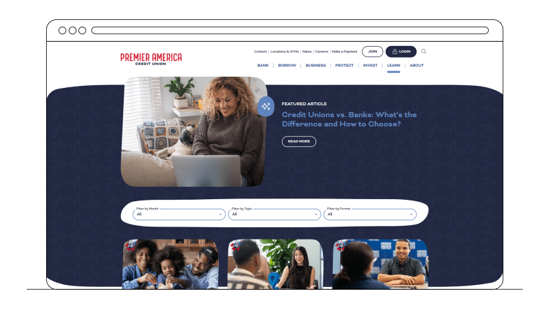
The credit union members using the new website could instantly spot the difference:
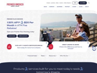
- Easy to find information thanks to a more intuitive site structure and customizable search
- The site works well on mobile devices thanks to a responsive design
- Online banking, calculators and location-based services are integrated into the website.
The website offers personalized content for audiences with different financial needs (e.g., young professionals, families). Based on their website activities, such as visiting product-specific pages, the website shows them the services that may be just the right solution for their life situation.
Editors are happier, too. The new platform enables them to use a range of widgets to build web pages with various layouts in an intuitive visual editor. Reusable content such as FAQs or cross-promotions is stored in a central content library, so it can be easily updated in one place.
All images and documents are stored in DXP’s built-in media library to keep everything in order in one location. Integrations link the platform to other marketing tools needed to ensure a seamless user experience: Kash chat, LocatorSearch, Formstack, OneTrust Cookie Consent and more. As the CU’s needs evolve, the DXP can be scaled and extended with other features and integrations.
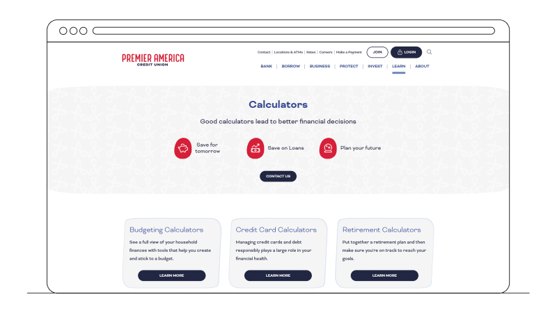
Results

“In my career, I have launched many websites, and few have gone as smoothly as ours with Kentico.
It has allowed us to reduce the time to make website edits, follow compliance guidelines, and maintain the consistency of our brand experience. We have been with Kentico for several years and are pleased with the upgrade.”
Premier America's new website provides a better digital experience for members and a more efficient work for the marketing team.
In just two months from the upgrade, Premier America has already seen improvements in average session duration, page views, and conversion rates that highlight the role of redesign in achieving a more engaging and efficient digital platform.
- 8% increase in average session duration
- 13% rise in page views
- 18% growth in conversion rates
Premier America's story testifies that upgrading can be smoother than you may think, and the benefits are huge.
Perhaps you're also considering modernizing your website, but you're stalling because of potential hurdles. So, let us guide you through the process, and let's write the next success story together! Get in touch today.

