Do you create new pages on your website efficiently, or do you believe there is space for improvement? If you already manage your content in Kentico, are you leveraging its full marketing power? Don’t waste time with brainless clicking and creating what already exists somewhere else. Make sure you know the full potential of the Kentico Page Builder, enjoy your everyday work, and ensure optimal results.
So, you have your copy and assets ready, you know what you want to say, who the target audience is, and your desired outcomes. Now, it’s time to create a new page on your Kentico website.
For high-traffic pages, landing pages, and other unique pages, Page Builder is the best tool. On the other hand, if you want to create product pages or blog posts, the preferred option is to use the structured content tab. Today, let’s put the popular Page Builder in the spotlight.
Let your creativity shine
The most frustrating thing for content managers is to be told “no, we can’t do that” or “we would have to change the code.” If you must strangle your creative ideas to the limited options allowed by your website, it’s understandable you feel like you’ve wasted your time.
In these cases, Kentico Page Builder offers a huge help. It gives you, as an editor, all the freedom you need to let your creativity shine while keeping your design and graphic style within the boundaries set by your brand. Therefore, you don’t have to worry that you will choose a layout, font, or design that would make your website look messy.
Developers can set up a higher or lower amount of control during implementation to the editing team’s needs. Page Builder’s maximum flexibility guarantees that developers can either use our solution as it is or customize its functions and user interface to meet the company’s needs.
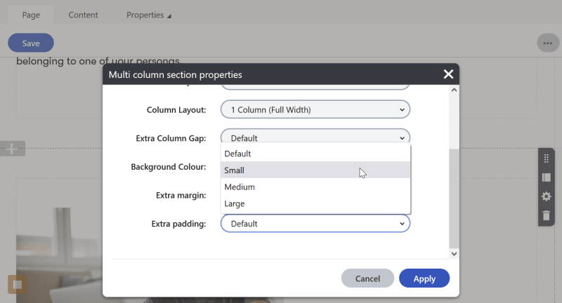
Page Builder gives marketers the freedom to adjust a page design within the boundaries set by developers.
Reuse content already placed on your website
Let’s imagine that you’ve created your page and see that it relates to several other pages your visitors might be interested in. So, you decided to offer them relevant content in cards at the bottom of the page.
The big advantage of Page Builder is the ability to reuse structured data (data added to a website via a customized form).
You can add a widget to your page and choose several pages to display as cards. Automatically, the cards get filled with preset content, such as a title, description, and image. If the content doesn’t fit your purpose, the title is too long, or the picture doesn’t look right on the new page, you can adjust it.
Also, you might want to add a banner or a CTA that’s already on another page. Copy it with all its properties, including personalization rules, and paste it to your new page. You can go through your website and collect all the desired widgets into a clipboard. Then, you add each of them wherever you need.
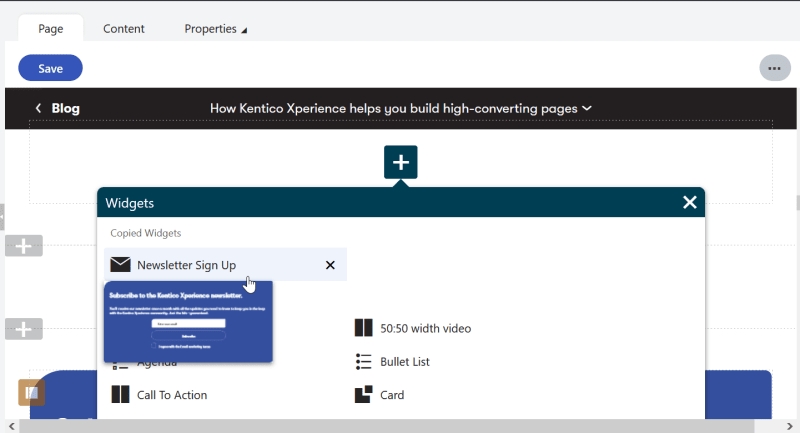
When selecting a copied widget, you can see its preview so you’re sure it’s the right one.
Tailor content to every user’s needs
Your page probably needs to serve several different audiences. Whether it’s parents and students, visitors signed up/not signed up for a newsletter, or users coming from various landing pages, you want to offer each of them precisely what they came for. By personalizing your page, you cater for every user journey.
The big advantage of Kentico is, that marketers can set up personalization without developers after the implementation. Every widget can be personalized without coding directly in Page Builder. In fact, it’s harder to find a business use for personalization than setting it up technically in Kentico. So, if you can imagine how to leverage it for your marketing purposes, your work is almost done. When you’re happy with the result, you can copy-paste a personalized widget with all its settings across your website.
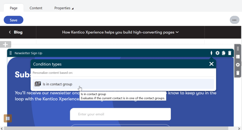
Why offering a newsletter sign-up to those who have it already? Personalize your widget and show more relevant content to returning customers.
Can’t decide which is better? Let an A/B test be the referee
Sometimes there are too many opinions involved in the final decision. Which headline is going to resonate better? Which CTA are users more likely to click? And should the form be at the top or bottom of the page? Luckily, you don’t need to vote or guess.
In Kentico Xperience 13, you can set up an A/B test directly in Page Builder. You create two variants of your page, choose a visitor segment and run the test. Then, you select the winner based on data insights, and Kentico automatically replaces the weaker variant. This tool helps increase conversions and prevents hard feelings in the team.
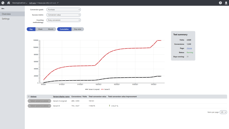
The built-in analytics provide quick results of A/B tests and allow you to choose the winning version in one click.
Optimize your web pages for the best results
Using Kentico Page Builder, you feel like a magician pulling more and more exciting objects from their hat. Envision a new page and see it materialize in your hands even if you consider yourself more talented in business than technologies. Try and test different options until you get the optimal high-performing page, irresistible for visitors. Then, you can sit back and watch your conversions rising.
Curious to know more? Book a personalized demo and let one of our experts answer all your questions.
Subscribe to the Kentico Xperience newsletter
You'll receive our newsletter once a month with all the updates you need to know to keep you in the loop with the Kentico Xperience community. Just the hits—guaranteed.
